This post contains affiliate links.
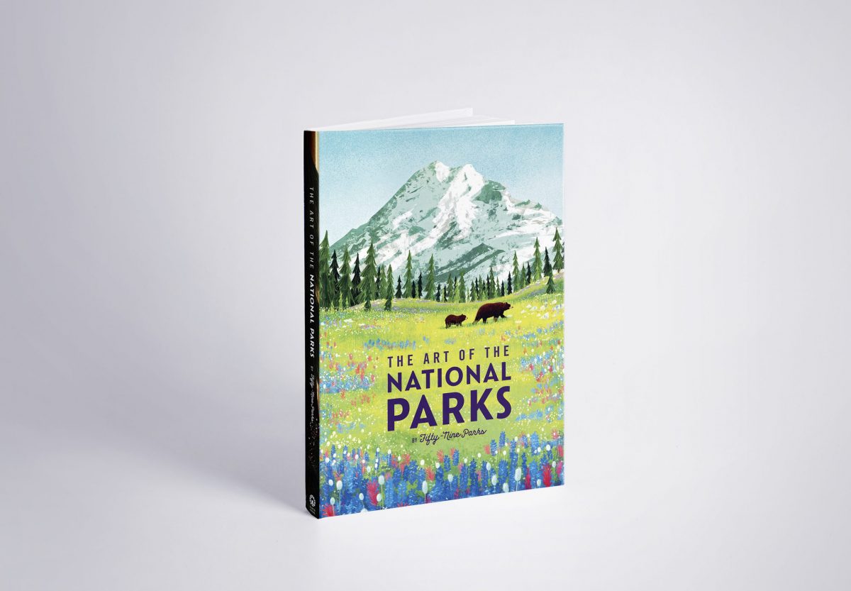
Similar to works of art, our national parks are distinctive for their beauty and uniqueness. Nowhere is their diversity better captured, perhaps, than in the Fifty-Nine Parks Print Series, which features screen-printed designs of each U.S. national park. Now, with the release of its first book, The Art of the National Parks, Fifty-Nine Parks has captured the magnetism of all 61 national parks in one place.
Published in partnership with Insight Editions, the book features bright, captivating work from some of the world’s foremost contemporary artists and designers. The posters — all screen-printed in the USA — offer a contemporary take on the WPA posters of the 1930s, while celebrating the unique beauty of each national park.
The book is broken down by region and includes a forward by President of the National Parks Conservation Association Theresa Pierno. Like the Fifty-Nine Parks Print Series — which donates 5 percent of the proceeds from each poster sale to the National Park Service (NPS) — a percentage of the profits from each book goes to conservation organizations.
We recently caught up with Fifty-Nine Parks Creative Director JP Boneyard to learn more about the book.
What can people expect from the book?
Each park is featured as a fairly large, vivid image that is accompanied by history and facts about the park. We wanted to make an art book that also offered some insight into the subject matter. It’s a good size for a coffee table book but also travels well and is relatively affordable. Those things were all very important to us. We want everything we do to be approachable and inclusive. 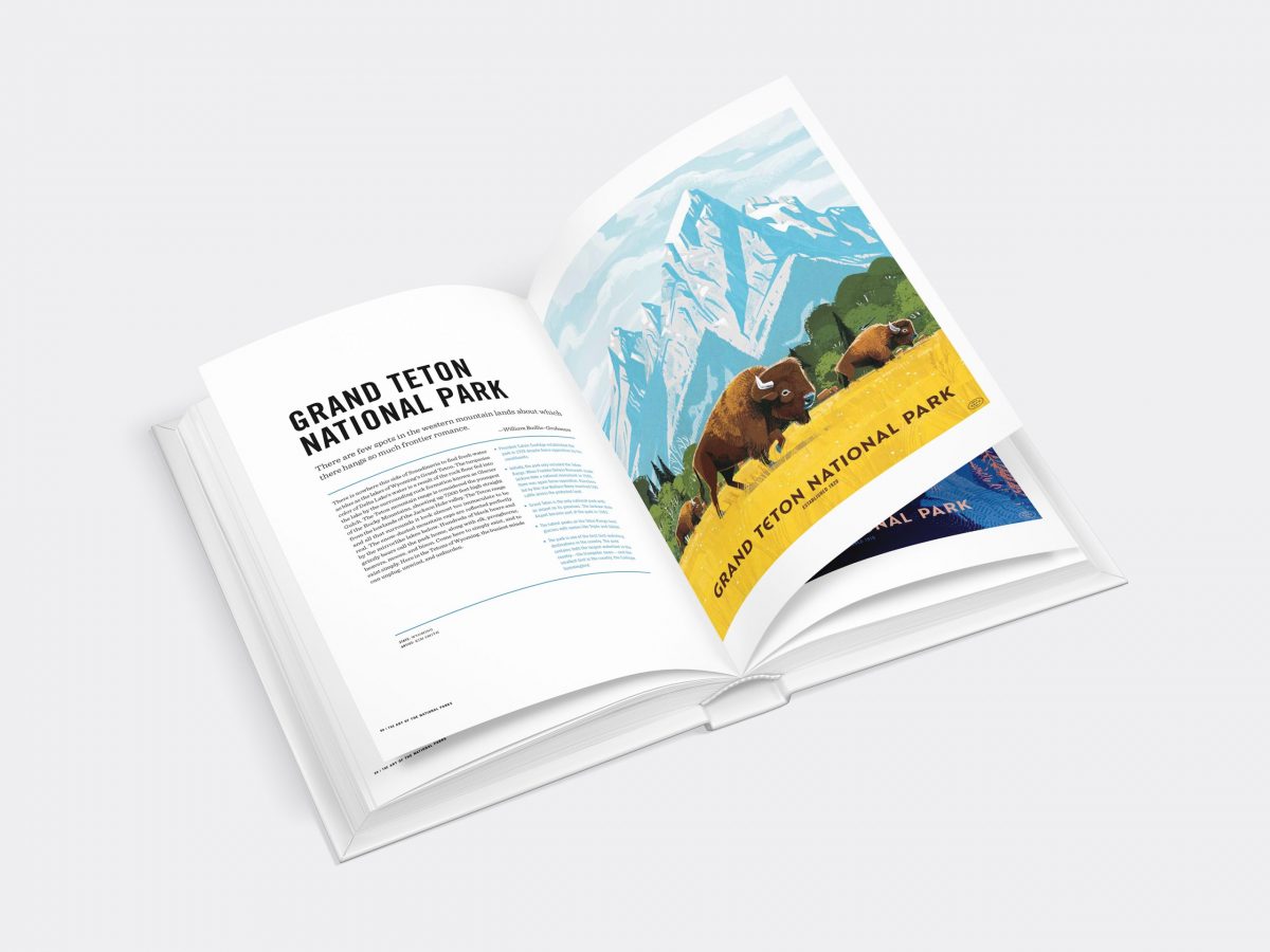
How did the idea for the book come about, and how did it all come together?
We loved the idea of compiling all of the work in one place. A book is a great medium for something like this.
We’re super grateful to work with Insight Editions on the book; they’re fantastic partners. Their attention to detail and print quality is second to none. We worked together on the design, conceptualization and copy for the book. Insight are the book experts though — they did the heavy lifting. We’re so stoked about how everything turned out and appreciate their hard work.
One of the cool things about the poster series is the diversity and range of artists and designers featured. Did you intentionally seek out artists with varying perspectives and styles? What is it like to see all of them highlighted in one place for all to enjoy?
Absolutely! We’re always happy to hear that this comes across in the work. We’re very intentional about most of our decisions — right down to which artist is paired with which park. The park system is made up of so many diverse landscapes with unique histories. We felt the parks would be best represented by a range of different creative voices. We couldn’t be more thrilled — and appreciative — of the hard work every artist put into this series. There’s so much joy inside the work. There are triumphs and struggles wrapped up in that creative process, too.
“The park system is made up of so many diverse landscapes with unique histories. We felt the parks would be best represented by a range of different creative voices.”
What’s wild to me is that I still feel blown away by prints made in 2016. You’d think that would wear off by now. Maybe that’s analogous to visiting the parks? Angels Landing in Zion isn’t going to stop being incredible each time we visit. My jaw still drops every time back at Glacier National Park. There’s just something awesome about the parks and the work everyone has put into the series.
Our last gallery show featured everything in the series to date, which included every National Park at that time. It was surreal to see it all hung up in one place — going from floor to ceiling, wall to wall. The book feels like the next best thing that we can all keep with us at home.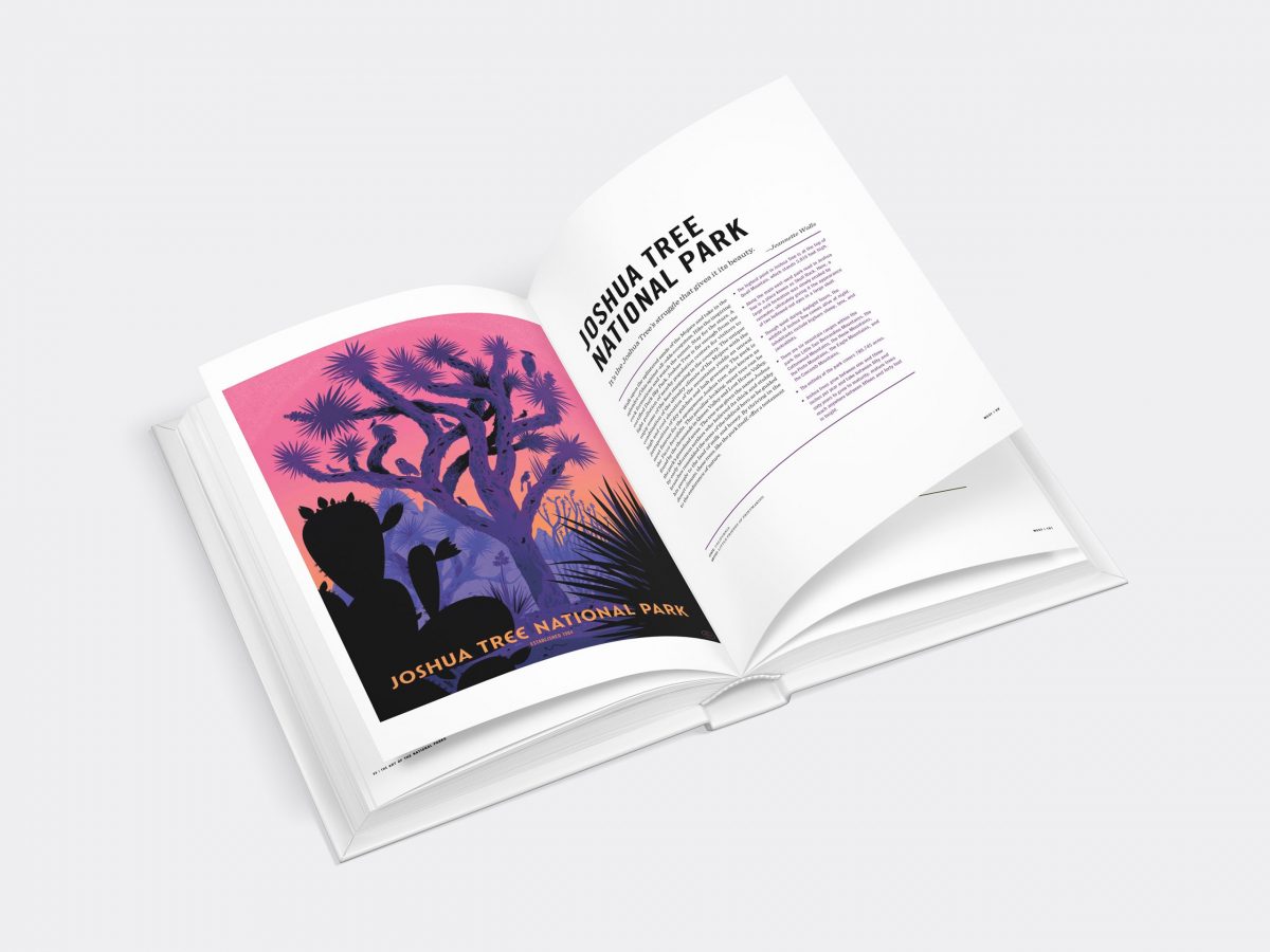
Another thing I love about the series is the fact that you donate 5 percent from each poster sale to the NPS. Is the same true for the book?
We consider it teamwork. Working with folks who share similar values is very important to us. Two percent of each book sale is donated to organizations that are focused on conservation. Insight Editions is very generous to make that donation happen for each book sold. They also work with Roots of Peace to plant two trees for every tree used in the making of their books. We couldn’t think of a better partner all around.
With so many beautiful posters to choose from, how did you go about selecting one for the cover?
It was really a challenge. Everyone has their favorite parks to visit. Everyone has their favorite animals and color palettes. It’s hard to put those things aside and just consider what makes for a strong cover. Ultimately, we wanted to feature a warm, vibrant print that casts a wide net. Mountains, flowers, fields, wildlife, rivers and tons of trees come to mind when we think “national parks.” The loose narrative with the two bears feels inviting, too. In some ways, we can put ourselves in their place on a hike. Or it could be seen as they’re going to lead us on this journey through the parks.
So many prints could have been the cover, though. We tried a ton of them. One of the biggest challenges is working with a composition that allows for the book title to feel integrated — not just tacked on. Glenn Thomas’ Mount Rainier print lent itself well to feature the title lock up. If it were possible, we’d have every park used as its own cover and let folks pick their favorite.
What do you hope people take away from the book?
We hope people will come away with a deeper appreciation for the parks and poster art. Not just the ones featured in the book, but all of the parks and all of the art out there.

